<mwc-icon-button> 
IMPORTANT: The Material Web Components are a work in progress and subject to
major changes until 1.0 release.
Icon buttons allow users to take actions, and make choices, with a single tap.
For the toggling version of this component, see <mwc-icon-button-toggle>
Material Design Guidelines: Button
Demo
Installation
npm install @material/mwc-icon-button
NOTE: The Material Web Components are distributed as ES2017 JavaScript
Modules, and use the Custom Elements API. They are compatible with all modern
browsers including Chrome, Firefox, Safari, Edge, and IE11, but an additional
tooling step is required to resolve bare module specifiers, as well as
transpilation and polyfills for IE11. See
here
for detailed instructions.
Example Usage
Standard
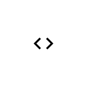
<mwc-icon-button icon="code"></mwc-icon-button>
SVG or Image
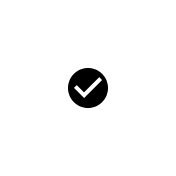
<mwc-icon-button>
  <svg xmlns="http://www.w3.org/2000/svg" width="24" height="24" viewBox="0 0 24 24"><path d="M0 0h24v24H0z" fill="none"/><path d="M12 2C6.48 2 2 6.48 2 12s4.48 10 10 10 10-4.48 10-10S17.52 2 12 2zm-2 15l-5-5 1.41-1.41L10 14.17l7.59-7.59L19 8l-9 9z"/></svg>
</mwc-icon-button>
Disabled

<mwc-icon-button icon="code" disabled></mwc-icon-button>
Custom Style
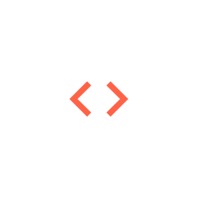
mwc-icon-button {
  color: tomato;
  --mdc-icon-size: 50px;
}
Fonts
Most users should include the following in their application HTML when using
icons:
<link href="https://fonts.googleapis.com/css?family=Material+Icons&display=block" rel="stylesheet">
This loads the Material Icons font, which is required to render icons, and is
not loaded automatically. If you see plain text instead of an icon, then the
most likely cause is that the Material Icons font is not loaded.
To see all icons that are available in the Material Icons font, see
Material Icons.
For technical details about the Material Icons font, see the
Material Icons Developer Guide.
API
Slots
| default | Optional <img> or <svg> to display instead of using an icon font |
Properties/Attributes
icon | string | '' | Icon to display, and aria-label value when label is not defined. |
label | string | '' | Accessible label for the button, sets aria-label. |
disabled | boolean | false | Disabled buttons cannot be interacted with and have no visual interaction effect. |
Methods
None
Events
None
CSS Custom Properties
Inherits CSS Custom properties from:
--mdc-icon-button-size | 48px | Sets the size of the button wrapping the icon. |
Global Custom Properties
This component exposes the following global theming
custom properties.
--mdc-icon-font | Font that supports ligatures and determines which icons are available (see fonts above). |
--mdc-icon-size | Sets the size of the icon. |
--mdc-theme-text-disabled-on-light | Color of icon when disabled is true. |
Additional references


